
Tomo · University project · 2019 · Refined 2021
Tomo
A playful sock brand that turns packaging into a friend.

Project details
Role
Brand, Packaging & Motion Designer
Project
University assignment, revisited independently
Original duration
3 months
Tools
Cinema 4D · After Effects · Illustrator · Photoshop
Skills
- Brand Identity
- Packaging Design
- Concept Development
- 3D Visualization
- Motion Design
Tomo began as a university brief to create product packaging with a second life. Inspired by my experience working in a shoe store, I designed a children’s sock brand with animal characters and a reusable foot-measurement guide. I later revisited the project through updated branding, Cinema 4D mockups, and animation.
YSDN 3010 · Professor Albert Ng
The starting point
An idea from the shop floor.
Working in a shoe store, I saw parents struggle to keep up with growing feet and children who weren’t always keen on shopping—or wearing socks. I wanted to make that everyday purchase more inviting.
What if a practical purchase felt more like meeting a new friend?
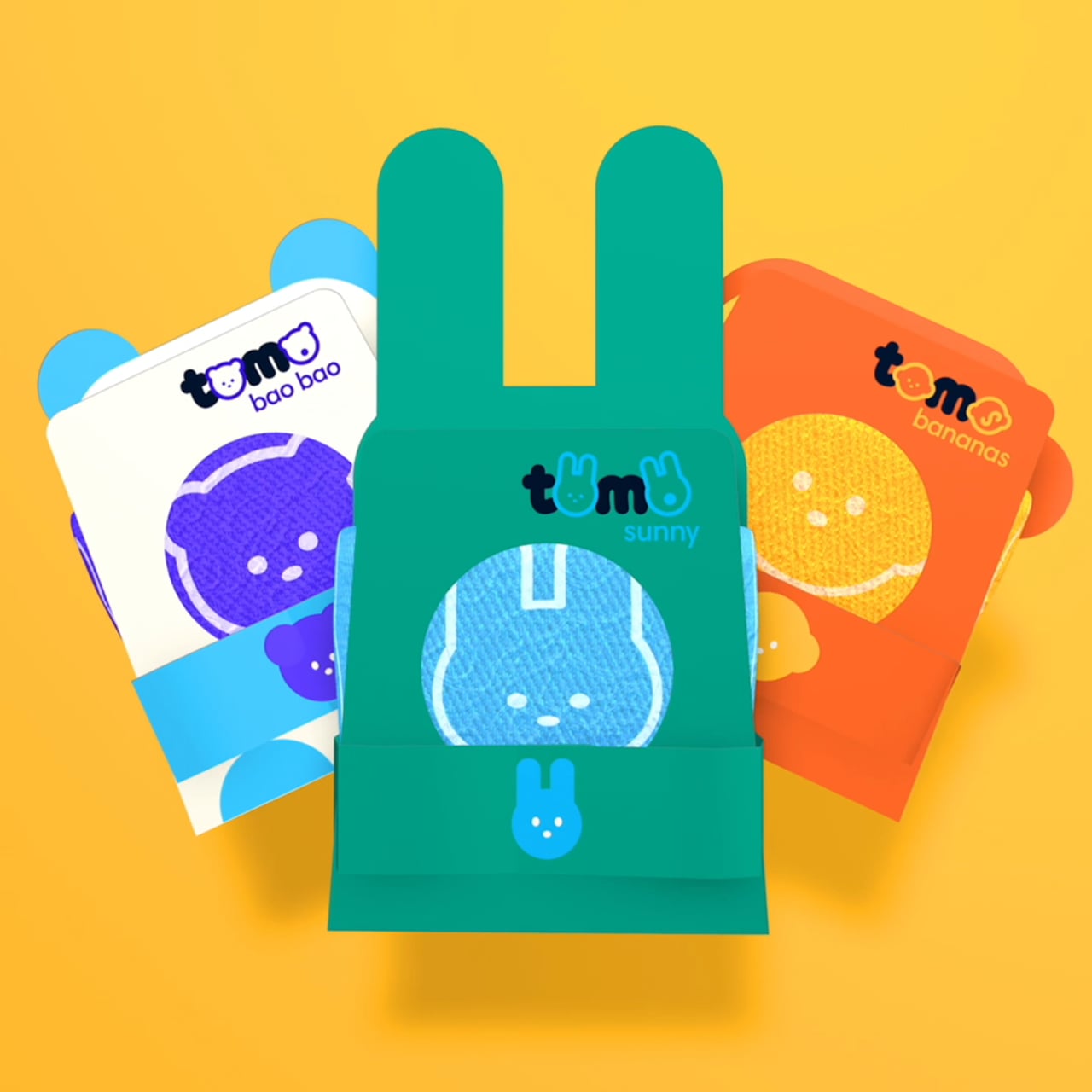
Characters and branding
Characters built into the packaging.
Animal-shaped silhouettes, cutout paws, and tails extend the characters beyond the socks themselves. The packaging frames each sock’s face, bringing the product and its character together.
- Banana the monkey
- Bao Bao the panda
- Sunny the bunny

Packaging development
Made to keep.
A foot-measurement guide inside the package gives it a use beyond the first unboxing. I developed the original packaging through printing, cutting, and testing physical versions, exploring how the design worked as an object.


The refinement
Revisiting Tomo.
The package structure stayed largely the same, while I revisited the logo, copy placement, and brand expression. I rebuilt the packaging in Cinema 4D and added a QR tag linking the physical concept to a proposed digital companion.

Tap the palette to see the colour values full size


Motion
Giving the characters movement.
I wanted the characters to feel like they were bursting with positivity and energy. Bouncy movement brought that personality into the animation, extending Tomo’s playful identity beyond the packaging.
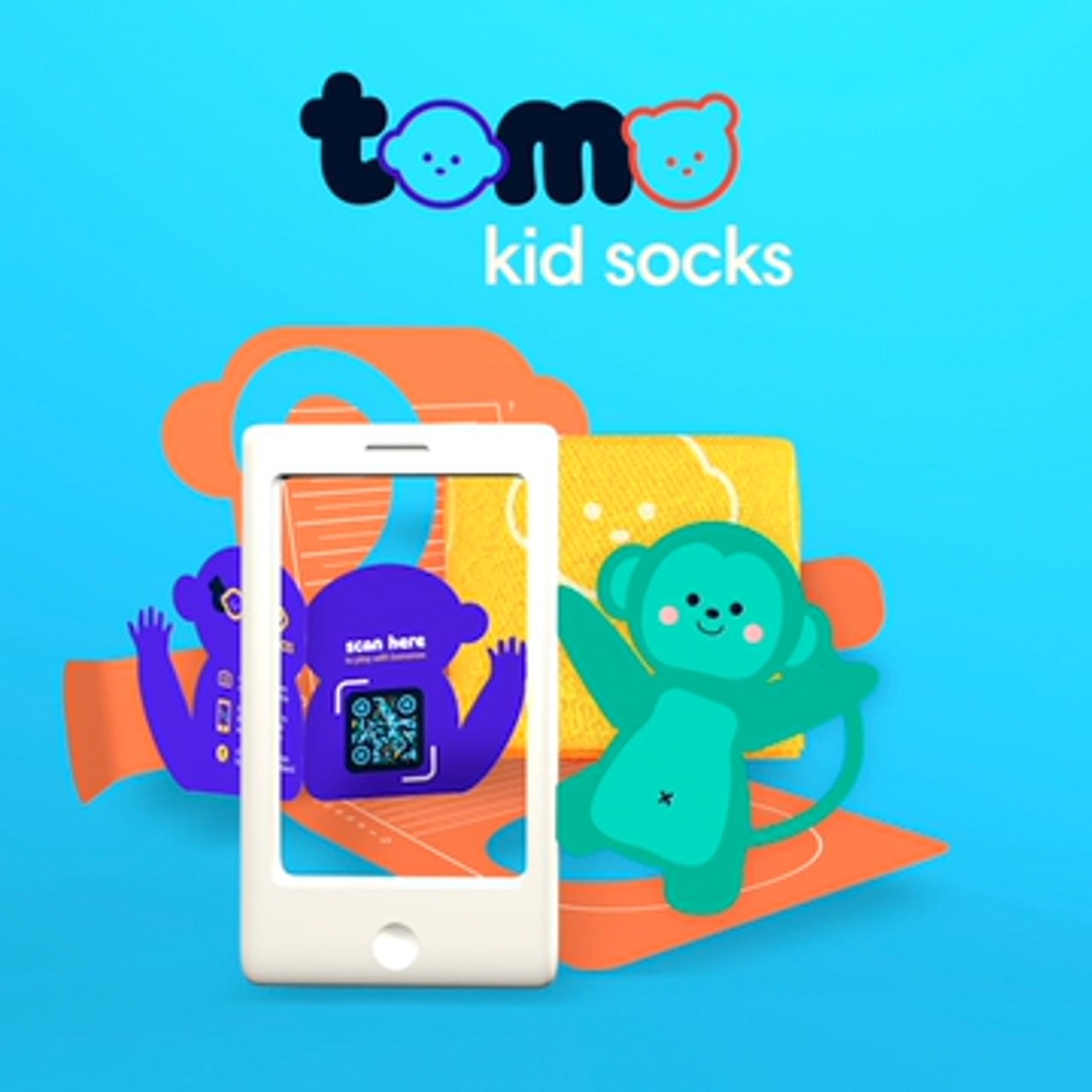
Proposed mobile experience
The QR tag connects the packaging to a proposed digital companion, where children could meet the characters beyond the physical product.


Reflection
A project I grew alongside.
Returning to Tomo gave me a way to build on a physical design project through branding, 3D, and motion. It still reflects the kind of work I enjoy: playful, characterful, and rooted in an everyday observation.